NFL Sunday Ticket
interactive payment portal
I won an award for this
It’s the small things that turn out to be massive. This project won me a communications award at DIRECTV for carrying out this project from start to finish with legal and marketing following the designers truncation rules and creating and new legal disclaimer page to the UX.

What to expect
Here I’ll walk through a bit of problems solving I worked through regarding a Legal disclaimer and copy requirements for an already existing product.
I worked on
Communication and Negotiating
UI Updated comps with NEW legal copy.
UX NEW Page for legal disclaimer.
My Role
UI/UX
This is a project I was able to take ownership of and make decisions on design and copy. Halfway through the development of this project legal approached our team with new requirements.
That would involve me working through that request which became a very consuming process. My involvement as a design stakeholder gave me the position to make decisions on new UX behavior and new UI comps when reviewed with legal, marketing, development and management.
Working the UI
legal requirements changed scope
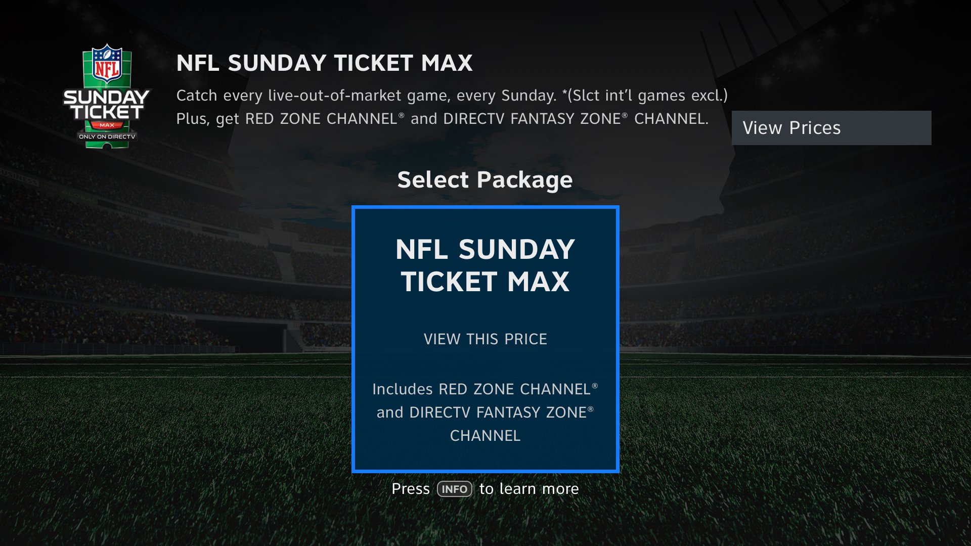
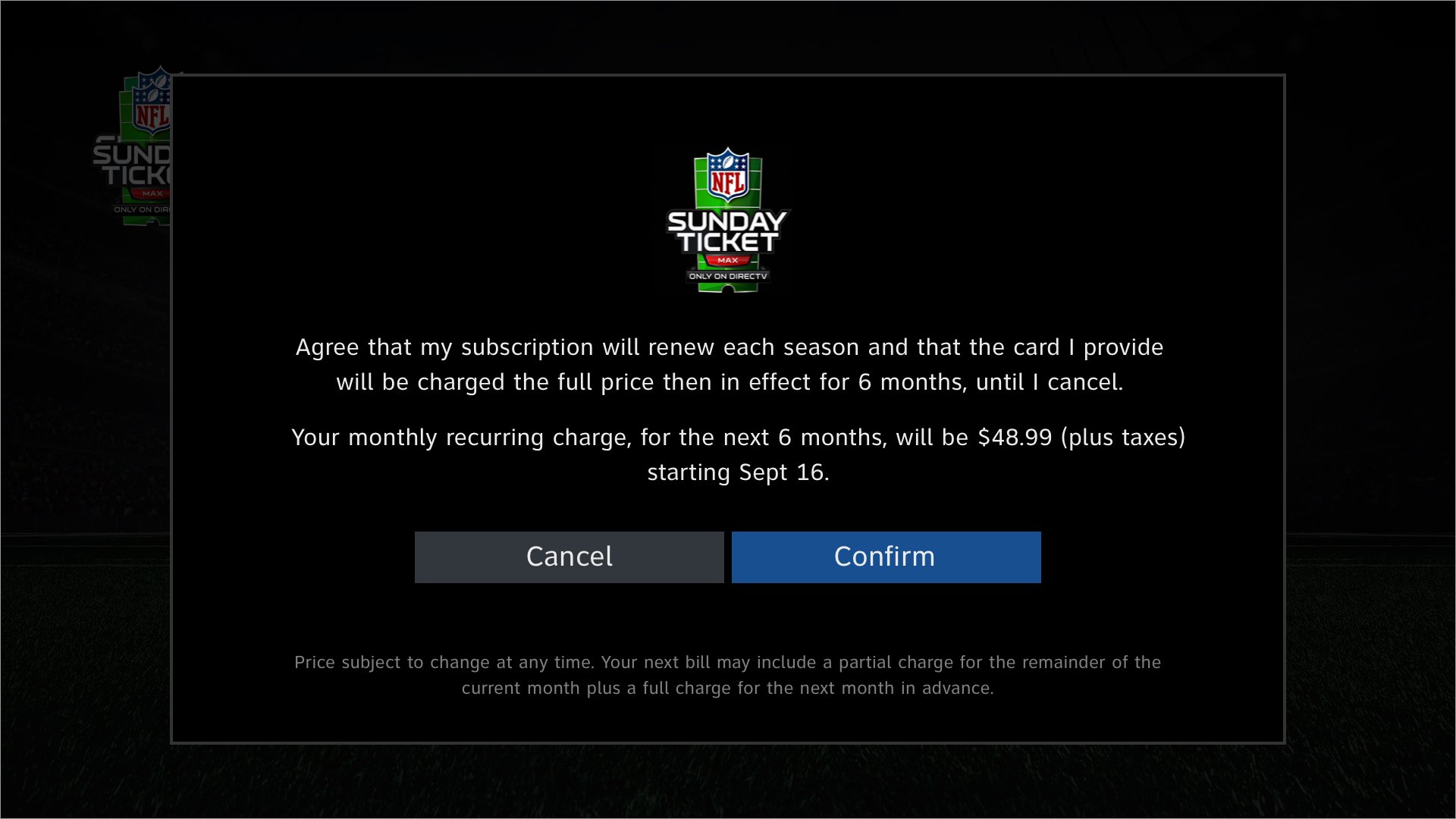
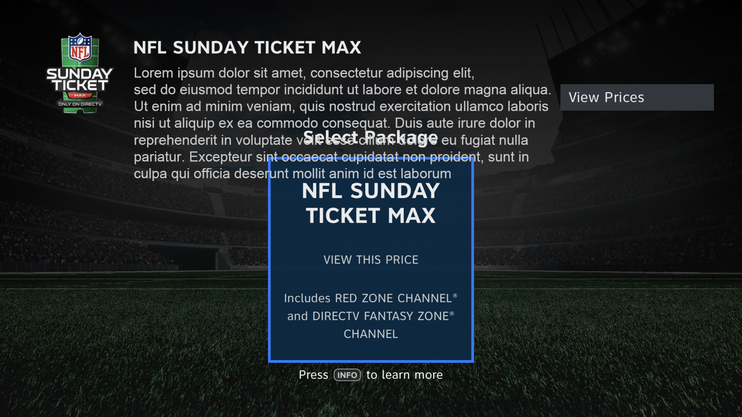
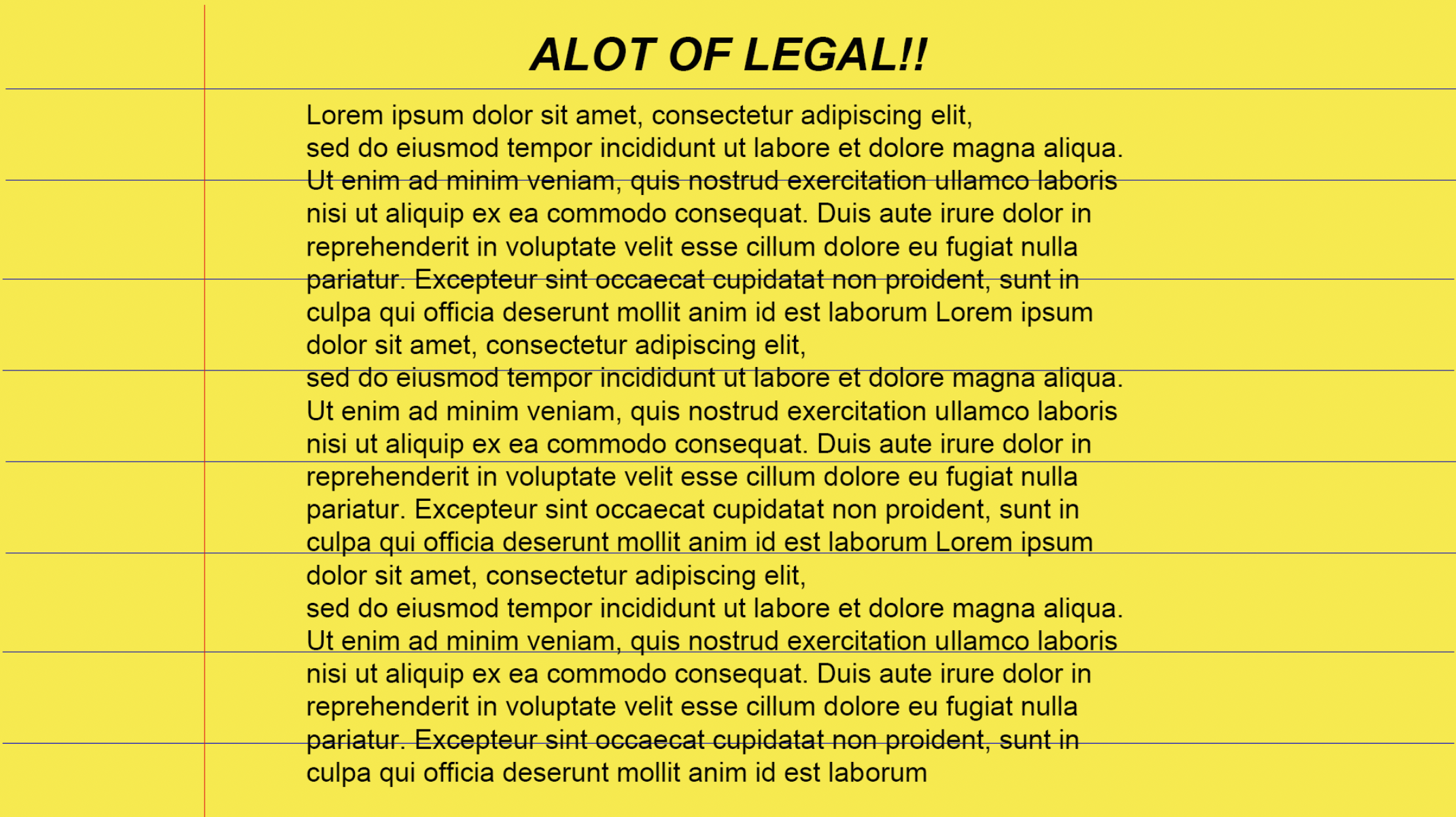
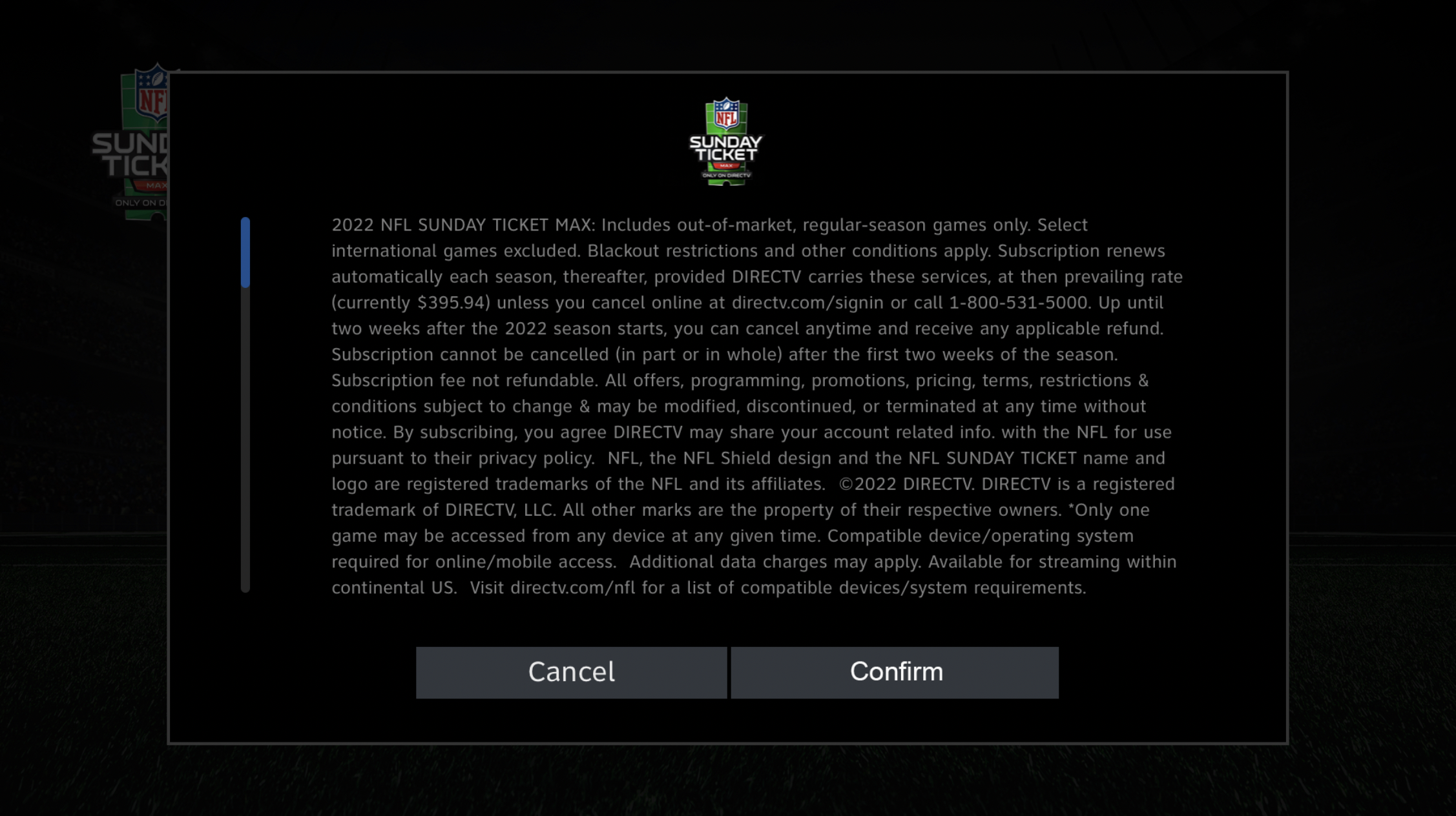
This is an opportunity for problem solving. First, here’s the problem. Legally required copy with no limits and no space in the existing UI to fit it all. Send it back and say NO.
PITCHING UI OPTIONS FOR THAT REQUEST
Below I explored different ideas to visually explain why this won’t work. In the bigger picture I’ve learned it’s better to comp up the failed versions for all of us to remain on the same page. A visual aid with written guidelines are easier for people to understand. I wanted the comps to be the support I needed in guiding people through truncation rules and design patterns.

❌ Excess copy would altar the already approved UI, resulting in a major change not in scope.
❌ Scroll bar is signaling user to scroll through and read unreadable copy and could result in disinterest
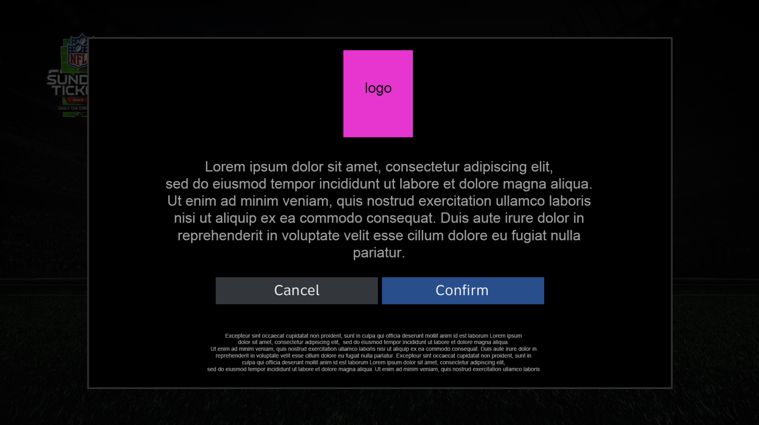
❌ copy is too micro small for readablitly and the amount of copy is too large. Page is dedicated to confirm selected plan VS read legal disclaimer. Too many calls to action on one page.
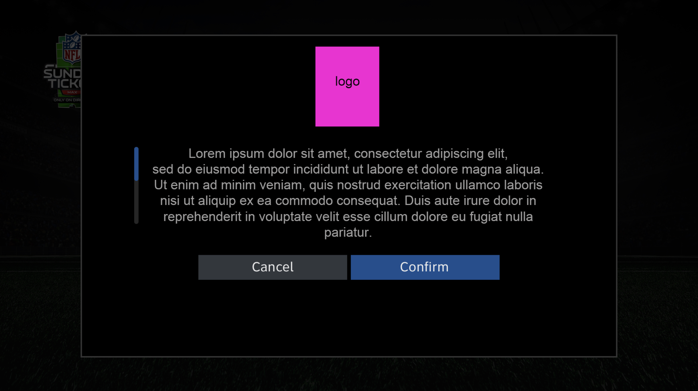
❌ Scroll bar signals user to read through copy that can be worded in 2-3 lines. User could results in disinterest and create more click for user.
legal language vs truncations
This seems easy. However, these are the moments to stay firm and classy with my design principles. It took 4 sprints of negotiating through emails, Teams calls and comps. The best way for me to solve this with everyone was to stick to the truncation guidelines established by the previous UI designer. That solved one issue for three different pages. Legal copy writers were the real heroes here.
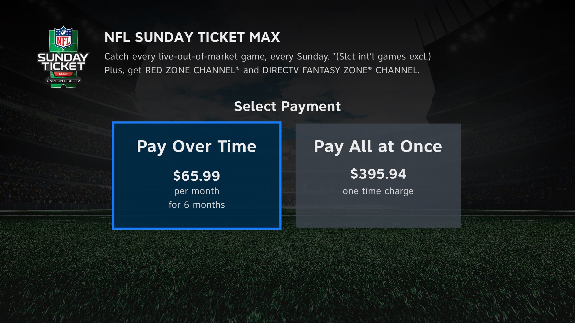
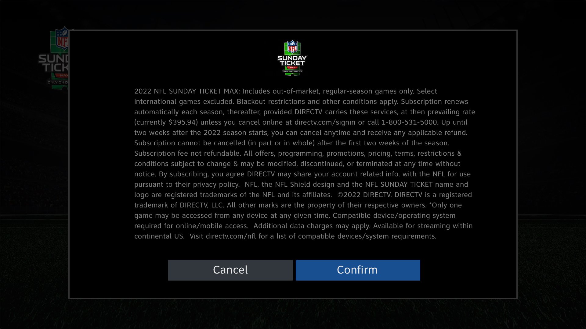
The UX can change
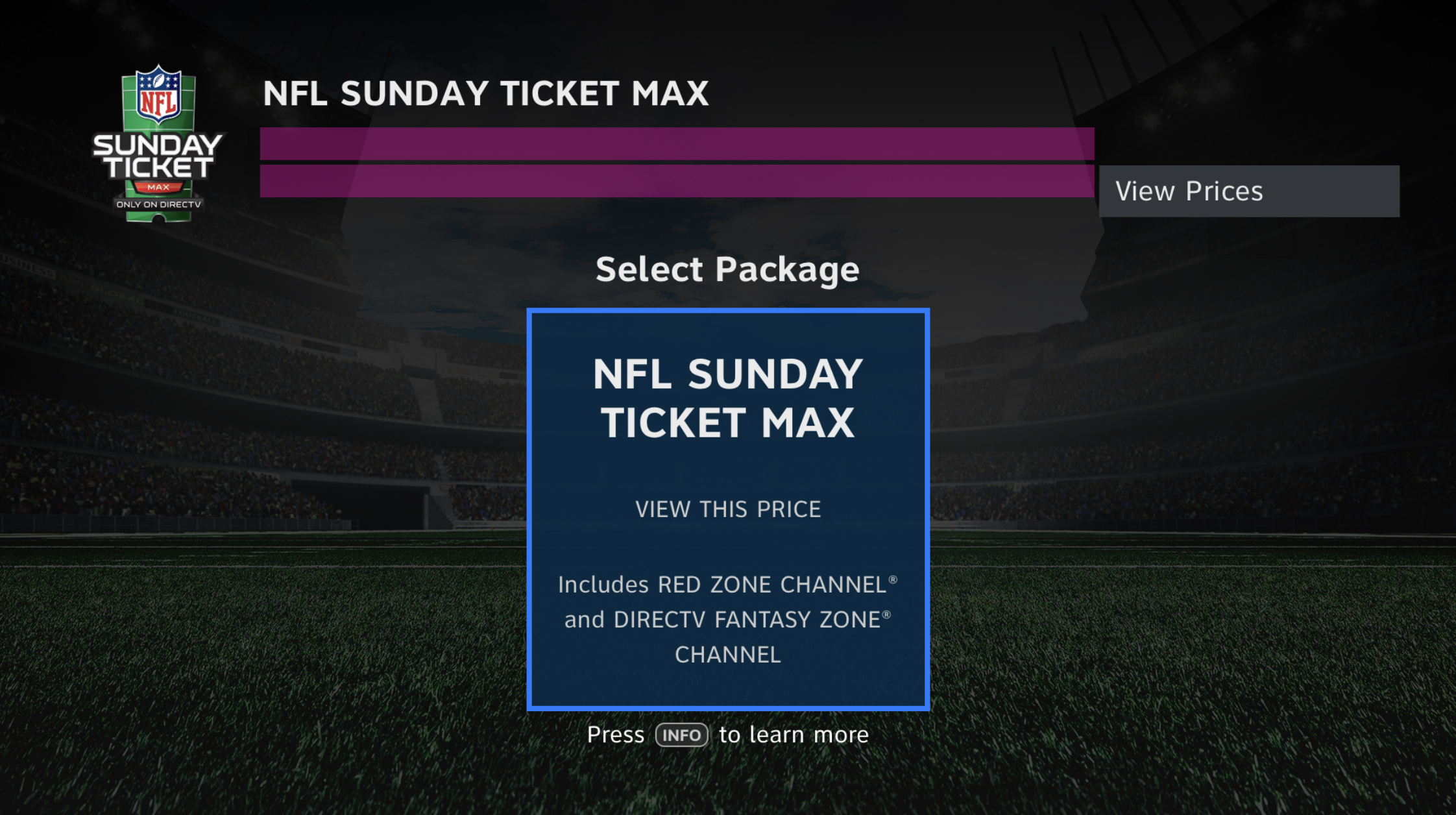
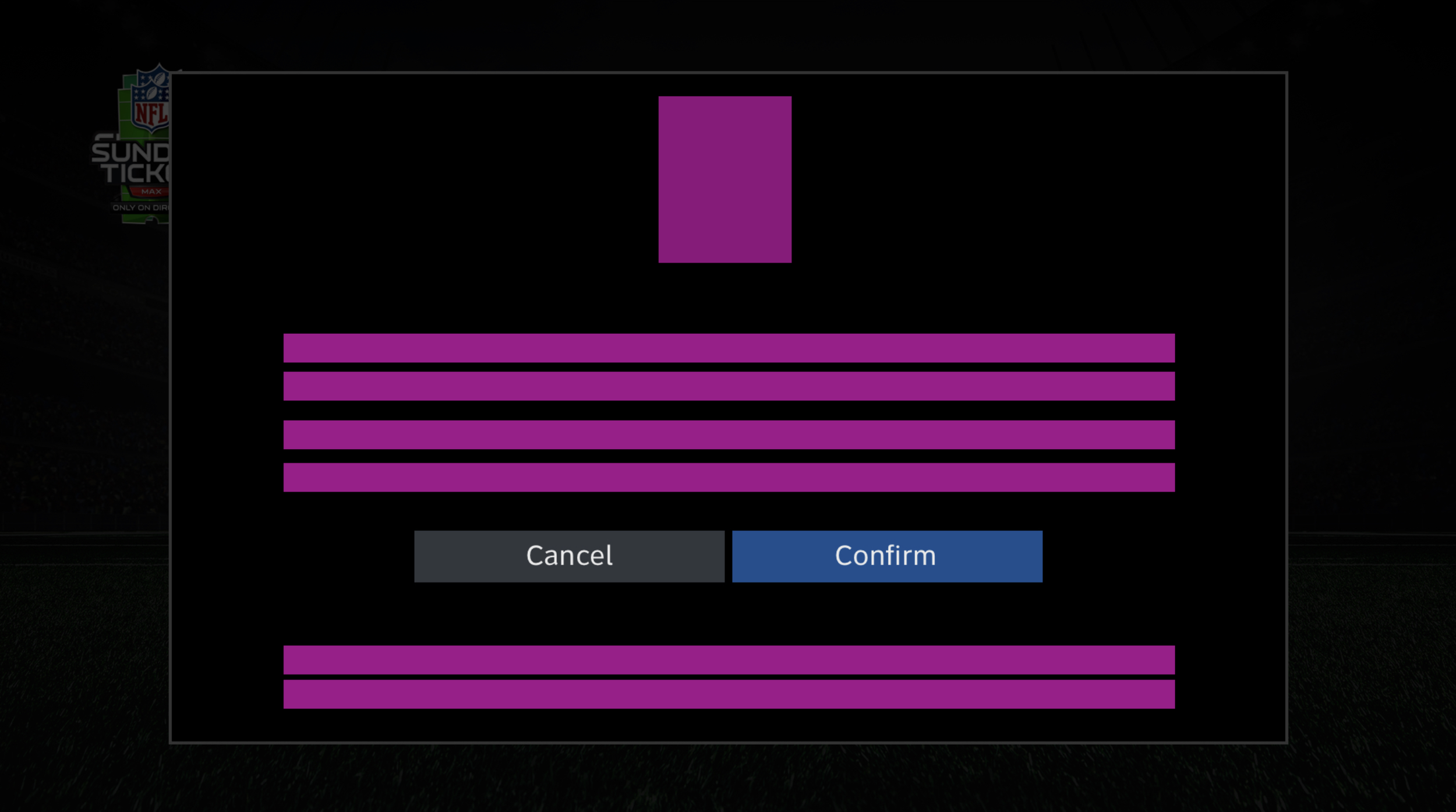
Adding an extra confirmation page
It was more logical adding this page to the UX pattern than to change the layout of the comps. There was just no way around the amount of copy this was. I worked with dev and there was one square space this copy would hold. So thats what I did. I think there was even a few lines that had to get axed. It worked, people were pleased and it was my choice to do it.


why is a legal disclaimer so important
Disclaimers notify users that you will not be held responsible for damages arising from the use of your website, products, or services. If users file legal claims against your site, your disclaimer can provide you with the legal support you need to successfully defend against those claims.
negotiation and problem soliving solutions
End results was I was able to accommodate what our company policy would legally need for users to become aware of since they were making purchases through our portal. And legal needed a way to make sure we had a space for that. Through design and communication I was able to make that happen.
story recap
Communication and Negotiating
UI Updated comps with NEW legal copy.
UX NEW Page for legal disclaimer.