FIFA WORLD CUP®
EXPERIENCE
Here you will find
Through innovative thinking, research and collaborative execution, I successfully implemented the first DTV bilingual sports app for the FIFA World Cup 2022 and implemented new user features, elevating the user experience and setting a new standard for inclusivity and accessibility in sports app design.
My Roles
UI/UX
For this project my responsibility was to establish which tournament templates were better suited for the World Cup Experience and which features would require a new update on the UX side.
Then, create all the UI comps and begin to process approval from all stake holders such as marketing, product owner, front-end development and QA.
Other responsibilities included user interviews and presenting final product to the set-top box (satellite television) side of the company.


LET’S GET INTO IT.
What I did
Action items I designed for this app
UI • NEW App color way that highlighted FIFA World Cup Qatar branding.
UI • NEW Photoshop a stadium image for sports mix background.
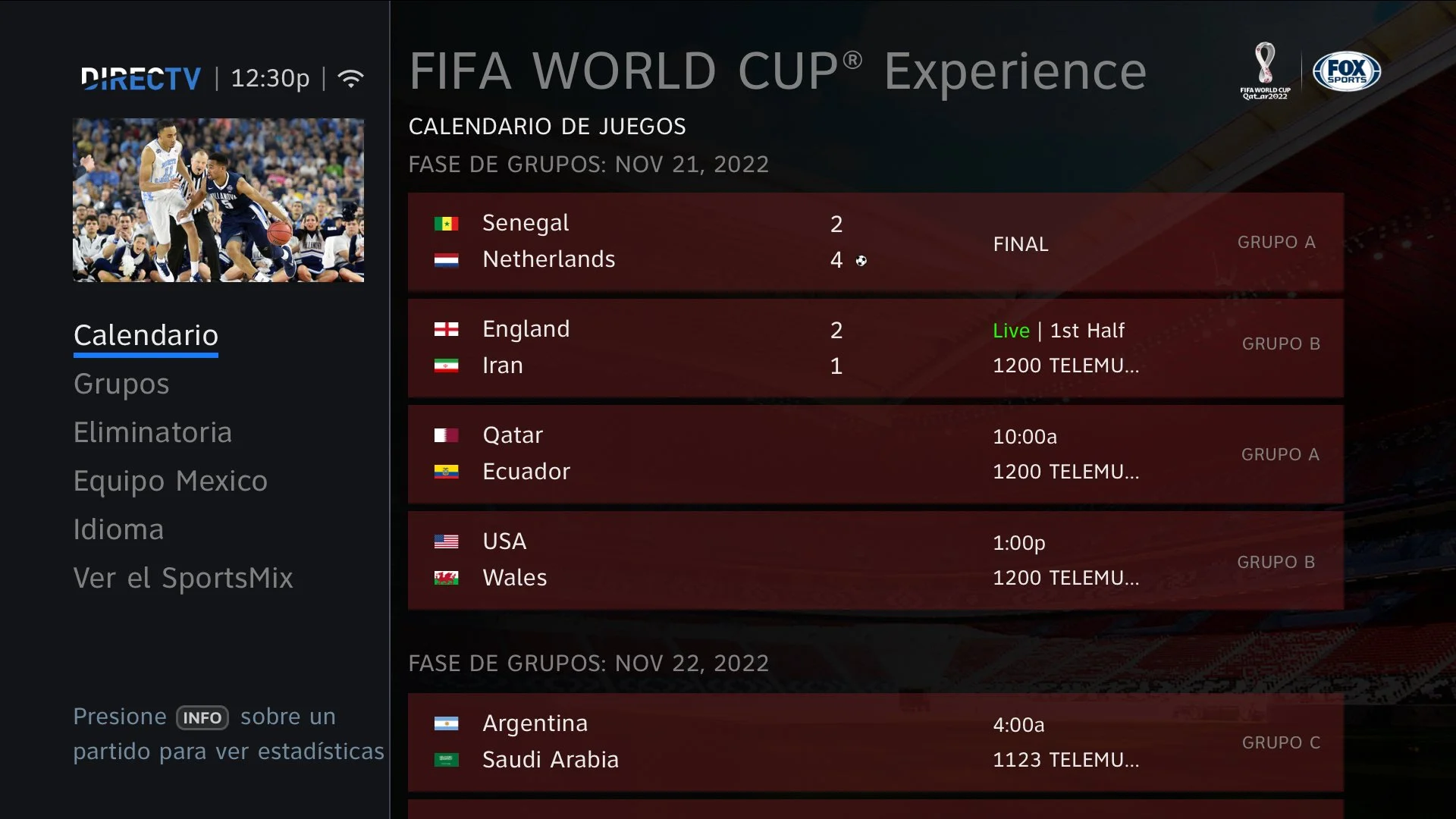
UI • NEW Translated English to Spanish comps for entire app.
UX • NEW Feature supporting Spanish language options for Latino viewers.
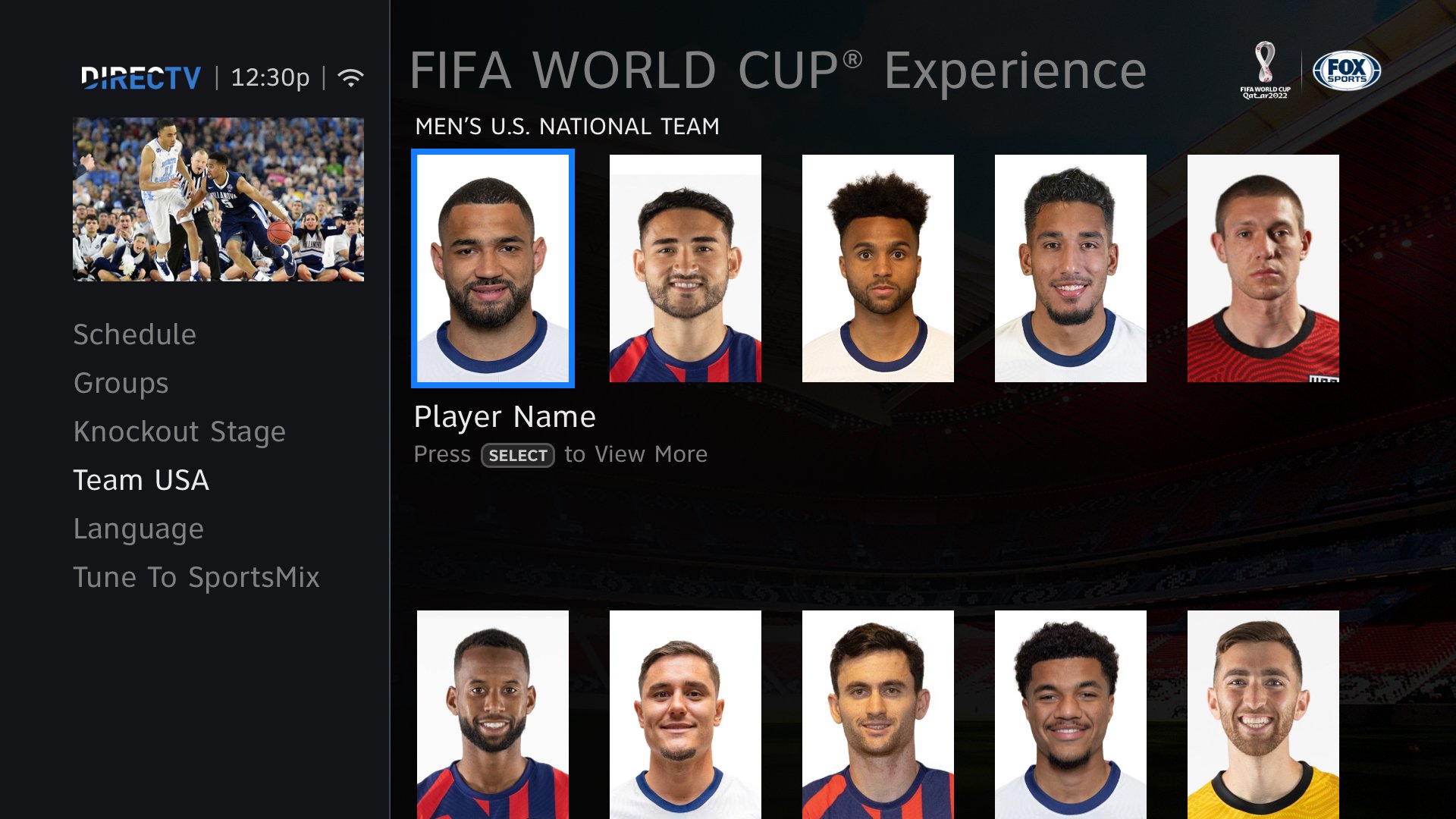
UX • NEW Feature that gives users access to individual GROUPS/TEAMS - overall data.
USER INTERVIEW
Jesse Cota Soccer fanatic
• Attended two different world cups
• Favorite player is Messi
• Follows several teams through out the tournament
• Importance on data like standings, schedules and match-ups.
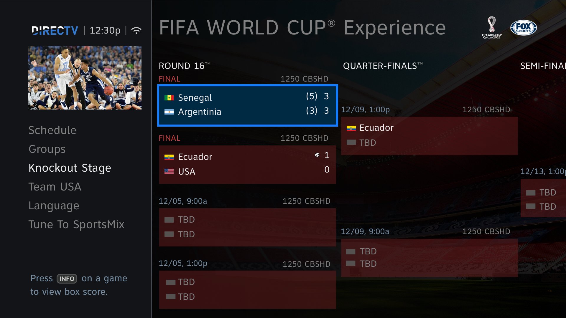
• Favorite portion of the WC is Knock-Out Stage.
“The knockout stages is always fun. Especially since the game can no longer end in a tie and sometimes it has to go all the way to nerve wracking penalties.”
First, WORKING THE UI.
MAKE IT STAND OUT
I explored many RGB PATTERNS to offer a unique branded experience.

+ Deep dark contrast gives a higher readability for users.

- High contrast decreases readability
- Monochrome pallete shows no relation to the tournament or sport

- Mid contrast creates a muddy visual distracting user from available data
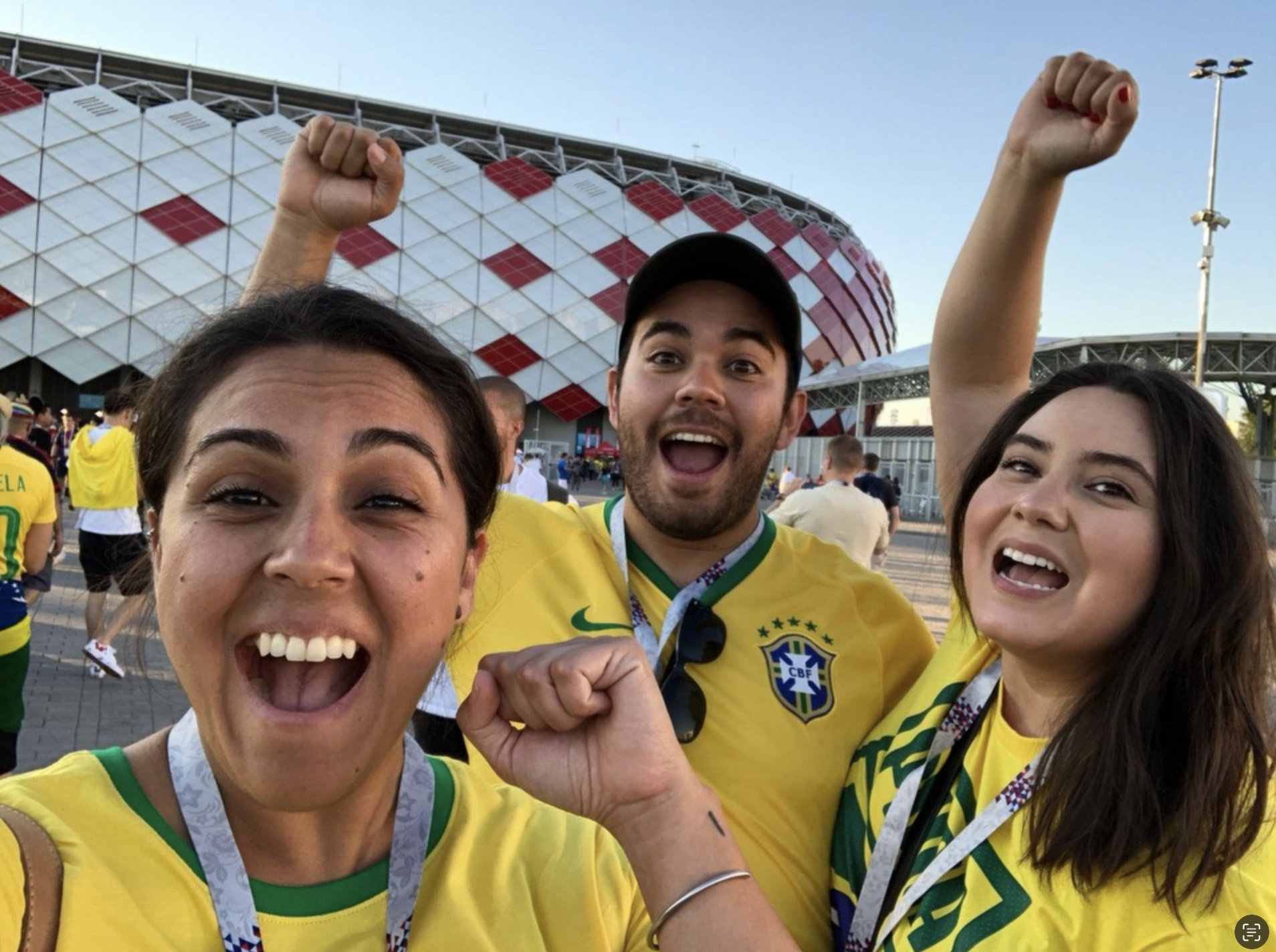
most watched tournament IN THE WORLD
This was the first time the World Cup would be featured as part of the global DIRECTV modern redesign done in 2018. I aimed for this app to stand on its own from the rest of the sports apps we launch all year.
SUPER BOWL Viewers
V.S.
57 Million Global
WORLD CUP Viewers
1.5 Billion Global

#8A1538 • 20% opacity • pass WCAG AA
The end result is giving user better readability and connecting the brand to Fifa. A double pass for Web Accessibility allowed for the Qatar red color to be the central color way for the app only by sticking to established UI patterns of transparency and dark background overlays. YAY!
knock-out
How will be the best way to keep Jesse updated on penalty shots?


Shoot out adds an extra score count
After Jesse’s info regarding knock-out stage not allowing any games to tie, I needed to add an extra score card displaying results from the “best of five” kicks from each team. My approach in adding the double score and not replacing the final and just changing the score title was based on competitive comparisons from google and ESPN. And in the end, the team with the most goals WINS!
NOW THE NEW UX FEATURES.
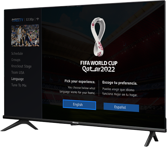
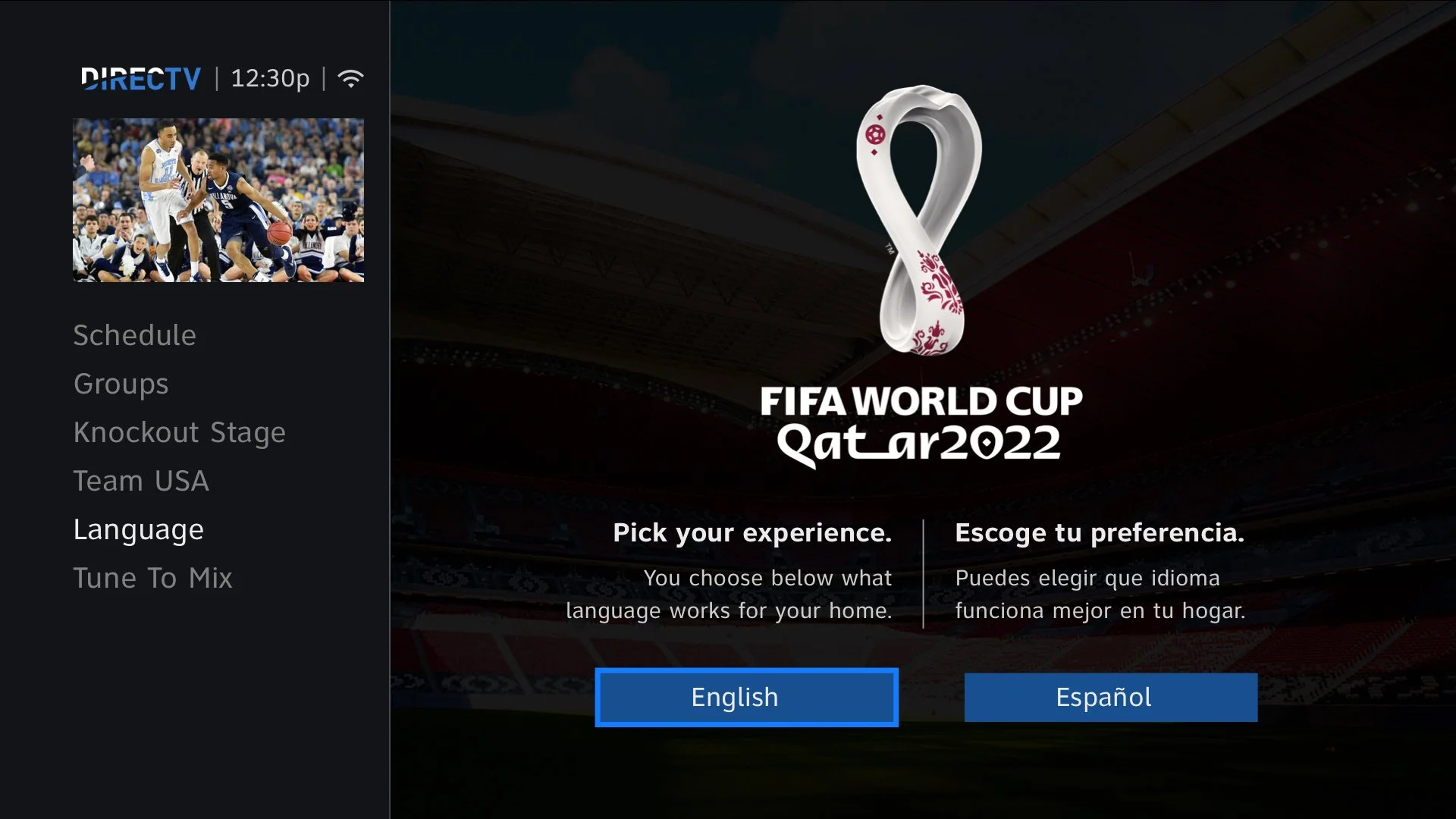
Customize
Pick your Language
Awareness with a large population of subscribers being latino and it being a favorited sport amongst the culture, I decided to implement a translated version of the app from English to Spanish and allow users to choose their preferred language after entering through the entry portal snipes. After user selects language the app will launch in the preferred selection until changed in the left menu option.
No other app on our platform supports this logic.


English to spanish translation
Since the option for a Spanish version of the app is now available, I had to then translate the entire app into Spanish. I did this after I completed the English version I received help from other Spanish speaking teammates.
End Results broadened audience engagement
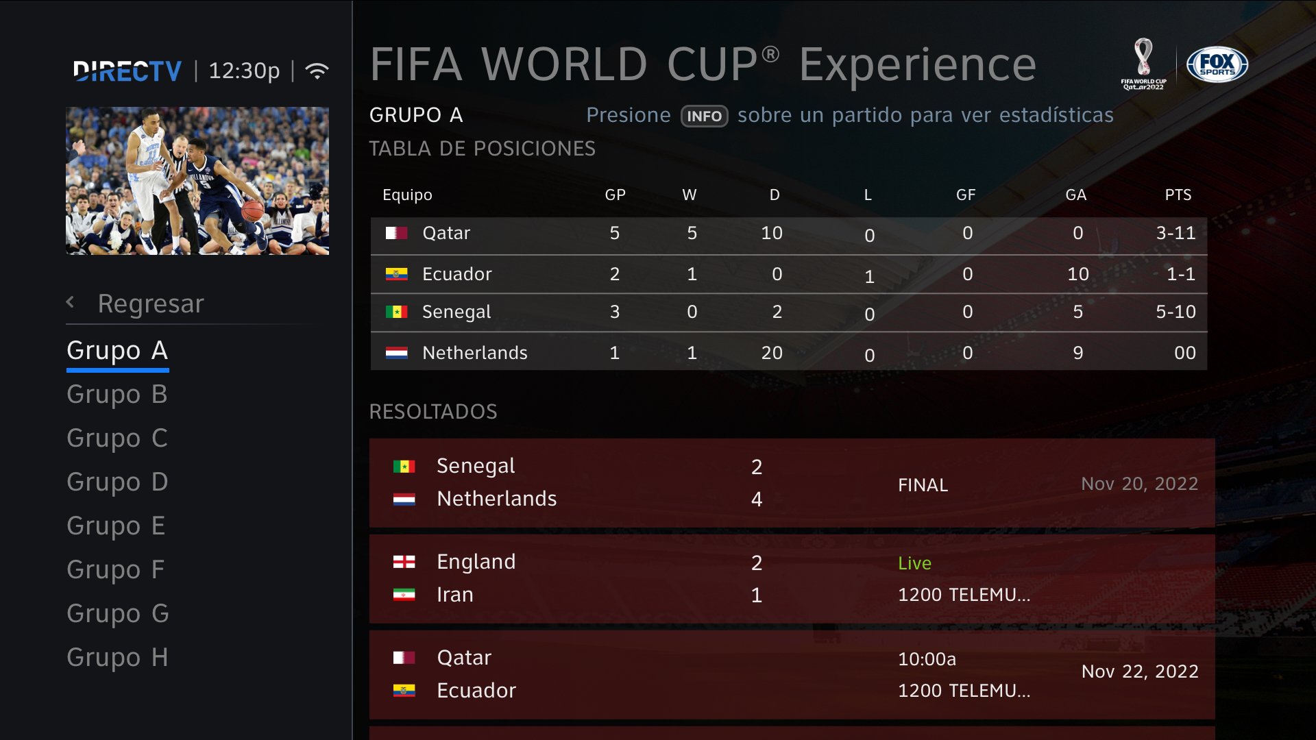
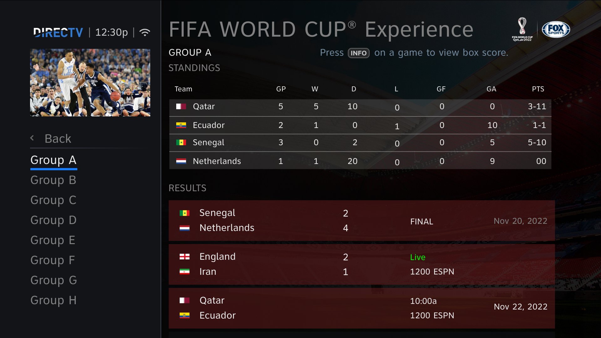
groups stage
it gets a bit complicated here
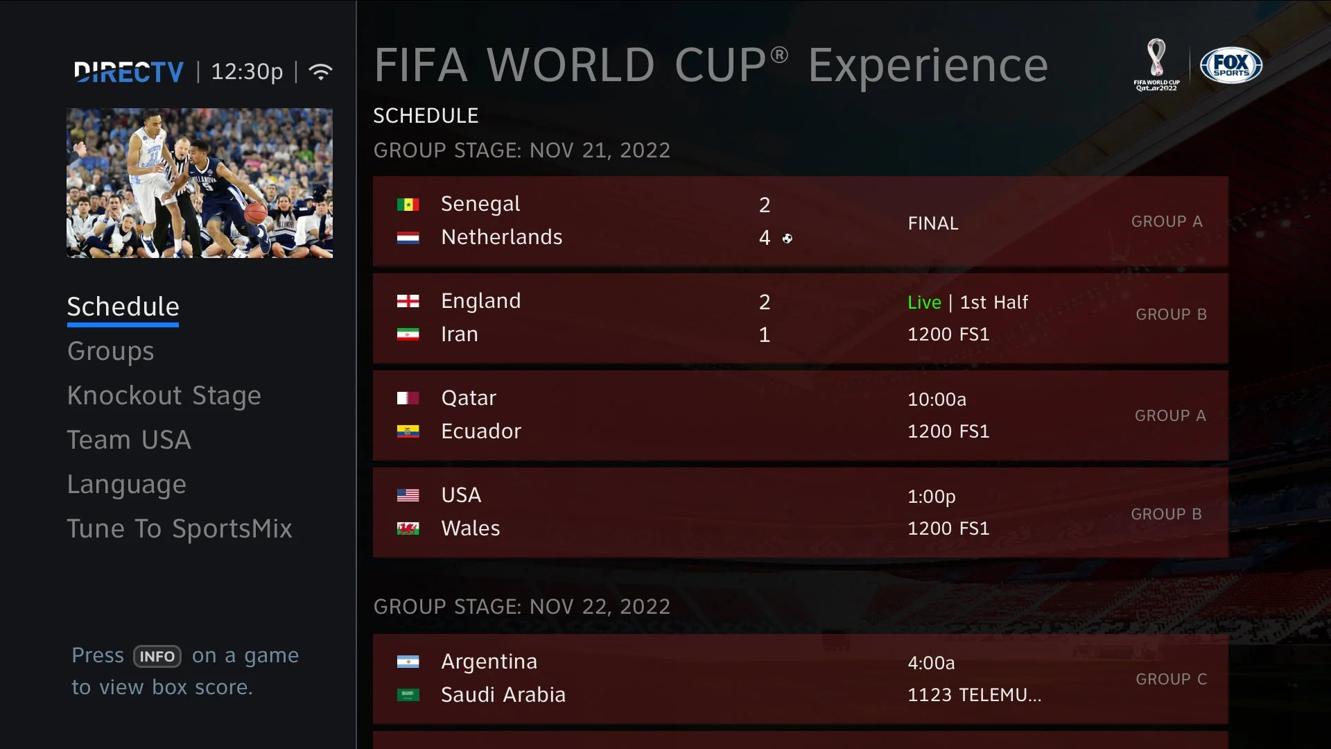
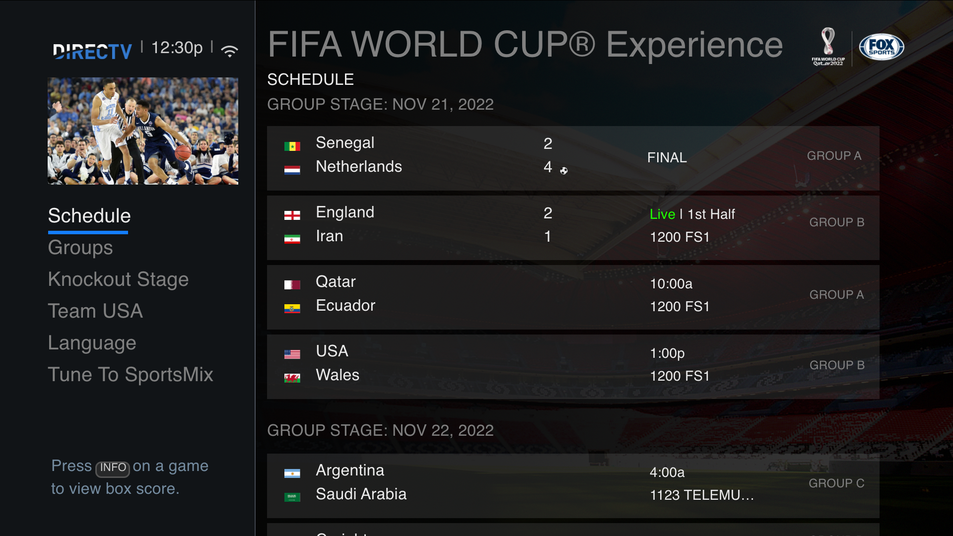
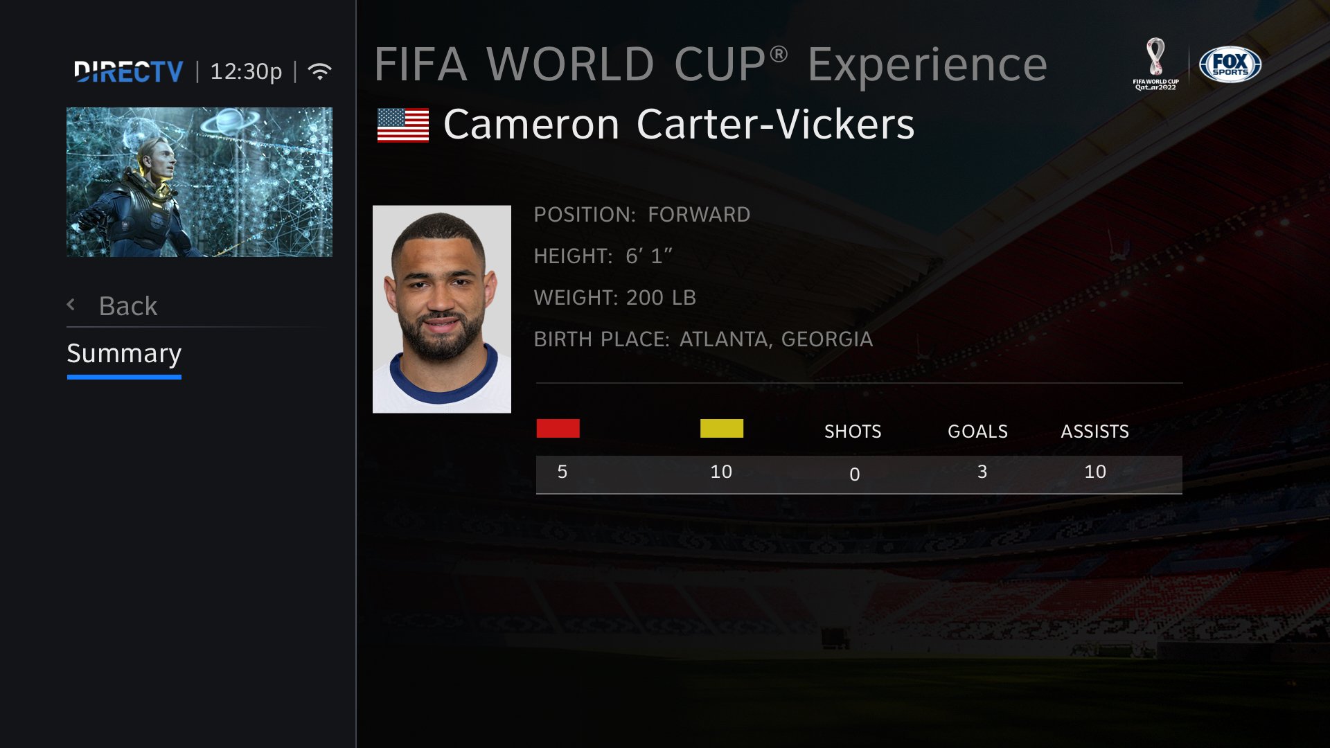
But this is a crucial space for users. This for me was a bit hard to understand. I myself have never been the type of fan to keep up with stats. So when I learned how the World Cup works, it kind of blew my mind. So in the group stage 4 teams all play against each other. The top two with the most points after six games gets to advance into the knockout stage. So I needed to have a place where users can come view those groups points, schedule, Group teams, Live stats and still have access to watch a live game and past games boxscore.


theres literally games all day long
So since this stage has a bunch of games happening at all hours of the day and night I saw opportunity. If a user wanted to keep track of all the groups they can also tune to whatever game is on live and even see the results of past games and well, while we’re at it lets throw in the schedule for upcoming games also. Honestly, the up and coming game schedule, that was my managers idea and it worked out. BOOM.
giving users more options to experience
• Schedule • Favorite Teams • Live Stats • Click To Watch on one page.
I designed
a FIFA world cup app


It took the wind out of me
haha JK. Im happy to have had this opportunity. A major thank you to dev team, product owners, management and marketing on making me feel so validated while designing these new features. I have to say I didn’t expect the support I was given. I’ve always been one to pitch a new feature and it’s always been ignored. Which is why this project has meant so much to me on my design journey.
QUICK RECAP
I was able to DESIGN brand new features
UI • NEW App color way that highlighted FIFA World Cup Qatar branding.
UI • NEW Photoshop a stadium image for sports mix background.
UI • NEW Translated English to spanish comps for entire app.
UX • NEW Feature supporting Spanish language options for Latino viewers.
UX • NEW Feature that gives users access to individual GROUPS/TEAMS - overall data.
What I learned
I learned a lot about how the World Cup functions from research and my interviewee Jesse Cota.
I learned how important my user interview would inform my design approaches.
I originally sent a list of extra screens like video highlights, editorials and extra player profiles but I learned to keep focus on the major milestones of the tournament.
I got to feel what it was like to have my decisions be chosen by all stake holders.